JUST INSPIRE:
REINVIGORATING A MULTIDISCIPLINARY BRAND
THE CLIENT
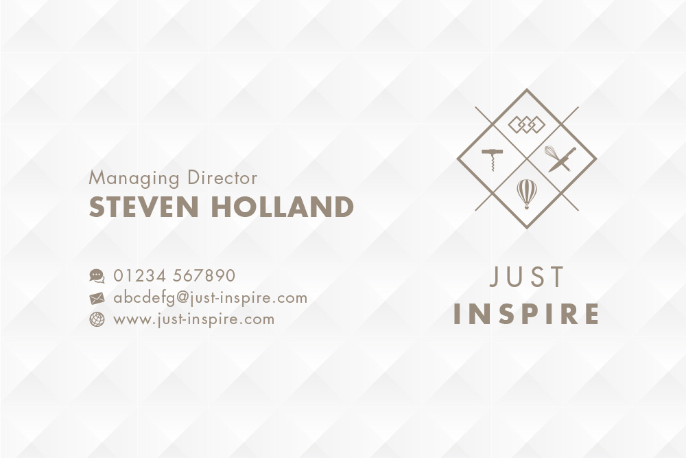
Established in 2009 Just Inspire Ltd was conceived by events and hospitality entrepreneur Steven Holland. Just Inspire’s core mission is delivering high quality hospitality events.
At the heart of everything about Just Inspire is Steven’s absolute core belief that passion and commitment drive great events and help deliver exemplary service.
THE BRIEF
Re-invigorate and build more brand awareness for the Just Inspire Group.
Our research concluded that the corporate image needed to reflect and embrace the multi-disciplinary business activites of the group and our approach was to communicate exactly what Just Inspire does and what makes it stand apart from its competitors. Visual consistency was required to embody the quality and uniqueness of this service led business.
PROJECT AT A GLANCE
WE ARE PIXELS Partner Mark McTiernan walks through the project from start to finish.
Pictorial Mark
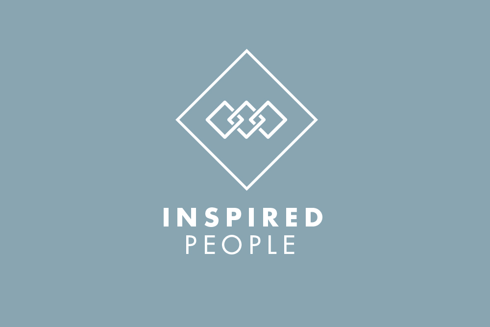
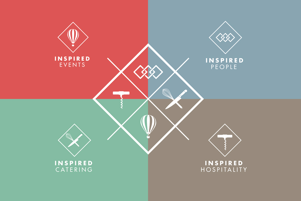
The central element needed to communicate the core nature of the business with clarity and impact. It was decided early in the design process that the main logo should incorporate a set of 4 simple pictorial icons which represent the 4 key concerns of the business – people, events, hospitality and catering. The elements should work in isolation as well as part of the set.
Shape & Structure
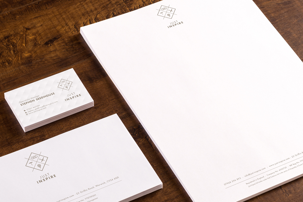
We strived to create a sense of balance through the introduction of a primary shape. The diamond not only helps contain the graphic icons but creates a visual motif and becomes an instant identifier of the brand. The geometric texture used on the face of the business cards also echoes this, therefore reinforcing the identity.
Brand Behaviour
Just Inspire is primarily a service led business, therefore as well as promoting the business to an external audience the brand identity needed to appeal to staff and encourage them to ‘live’ the brand.
THE DETAILS
Creating a brand identity.
Typography
A clean and contemporary sans-serif font style was utilised to represent the identity. The typeface Futura was selected as the primary font style mainly for its simple geometrical form which represents efficiency and forwardness – characteristics that promote what The Just Inspire Group stands for.
The font works well in relation and combination to the geometric shape and proportions of the pictorial mark.
Colourways
A core brand colour was created to build unity and trust within the identity, a low saturated and natural colour tone was selected to support the message of performance, reliability and teamwork being at the heart of the Just Inspire brand. A set of 4 secondary colours were created to reinforce the 4 key areas of Just Inspires business.
Brighter and bolder colours help retain each areas energy and personality whilst complimenting the core colourway. MD Steven was vey keen to get across the fun and passionate personality of the company and all who work within it.
BEFORE
AFTER
FINAL THOUGHTS
The new identity finally represents the multidisciplined nature of the Just Inspire Group. The pictorial icons introduce flexibility within the brand architexture and through simple space and form allow personality and clarity to the companies areas of expertise. The final result suggests a fresh and contemporary visual identity which focuses upon the businesses commitment to quality and service.
TESTIMONIAL
Steven Holland
MANAGING DIRECTOR | JUST INSPIRE
“As a Hospitality & Event Management Business I need to look professional and approachable. Like so many other business owners I was too close to be able to see where I was going wrong. The team at WE ARE PIXELS really understood my business and got the right information from us in order to get the job done.
I love our new brand, it’s timeless, fresh and modern – everyone I have asked loves it. I am more confident than ever now when pitching for new business. I can’t recommend Mark and the team highly enough.”