MONTPELLIER INTEGRATED:
REINVENTING AN AGENCY WITH A 20 YEAR HISTORY
THE CLIENT
Montpellier PR was established in Cheltenham in 1991 and enjoyed substantial growth over the following years expanding to provide both creative and new media services under the umbrella brand Montpellier Integrated.
Montpellier is widely respected as an innovative, early adoptive marketing communications consultancy, embracing technology solutions and ways of thinking that mark its place in the marketing communications industry.
THE BRIEF
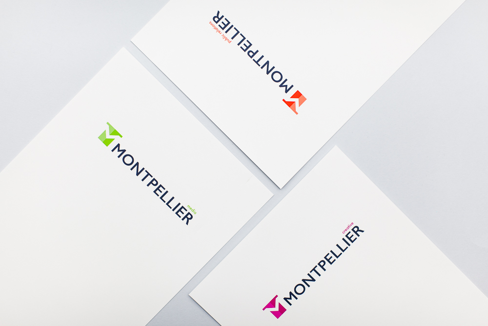
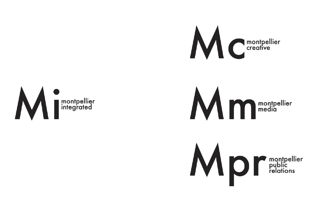
To refresh and modernise the identity of Montpellier’s three sub brands – Creative, Media and PR.
Each sub brand should feel complete in isolation but should integrate to show synergy between the three disciplines.
The rebrand should visualise the companies forward thinking ethos, reference its heritage and reflect its prestigious geographical location – Montpellier adopted its name from the area of Cheltenham in which the head offices are located.
PROJECT AT A GLANCE
WE ARE PIXELS Partner Adam Crohill walks through the project from start to finish.
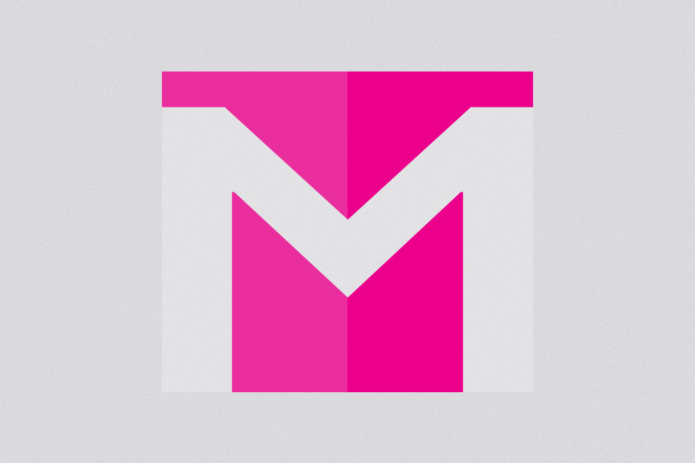
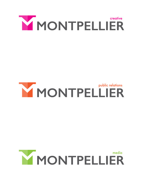
Pictorial Mark
Our aim was to create an identity that would be recognisable with or without the supporting word mark. In the modern digital climate it is paramount to create a brand that will adapt to the requirements of print and online to include mobile, Apps and social media.
Letterform
I enjoy using negative space within a design. The ‘white space’ at the centre of the pictorial mark creates a capital M. A pictorial and letterform mark rolled into one. The device helps to clarify the brand when the icon is used in isolation and I like the dual meaning, it’s a witty design statement… One of those YES! moments.
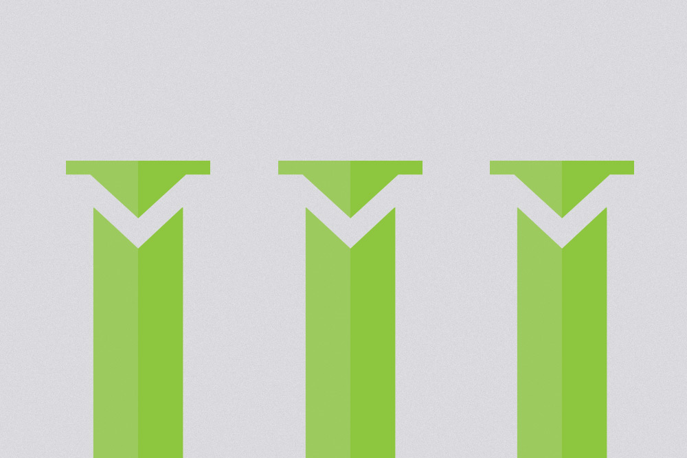
Regency Influence
The client was keen to evoke the architectural heritage of the companies location. This was the stimulus for the column style logo. The duotone colouring adds the feeling of shadow and depth whilst adhering to an ultra modern “flat design” aesthetic.
PRELIMINARY CONCEPTS
Three ideas that didn’t make it through.
Text Only
We rejected a ‘word mark only’ approach fairly early on as we felt the brand should have a strong visual identity to stand out in the digital age where, on occasion, a brand must be able to rely purely on iconography. The font we experimented with here was utilised in lowercase for the final service derivative label.
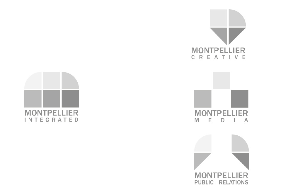
Squares
With the ‘squares experiment’ we decided to repeat a set of simple geometric shapes in different forms and arrangements to represent the three services of Montpellier Integrated. The basic simple structures experimented with here provided the basis of our Montpellier ‘M’ picture mark.
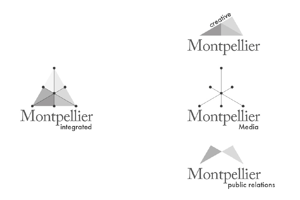
Triangles
Developing the idea of using flat shapes in different arrangements we created a low polygon design. I was very happy with this solution but after discussion with the client it became apparent that there was a preference for each sub brand to fully represent the parent brand in isolation. This led us to focus on a single recognisable icon that would be used for each service.
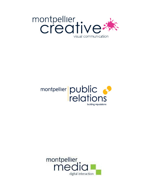
BEFORE
AFTER
FINAL THOUGHTS
New life has been breathed into the brand with a timeless design that feels a lot more solid and authoritative on the page. The colour tweak brings the identity bang up to date and the new picture and letter mark represent a modern forward thinking company with a prestigious heritage. The iconic picture mark means that the Montpellier brand is unmistakable, even when used in isolation.