PROTECH:
REDEFINING A MARKET LEADER
THE CLIENT
Protech is a leading UK information technology company, transforming the capabilities of the Third and Public sector. Trading for over 20 years Protech has developed extensive technology and change management expertise which support organisations in transforming their operations, service delivery and client experience through a platform of software modules.
THE BRIEF
Chief Executive Mark Trouth approached WE ARE PIXELS with a brief to refresh the company’s identity and raise the bar with all marketing material produced. All whilst retaining the key essence of the Protech brand look and feel.
Essentially Mark’s challenge was to raise brand visibility, stand out and reassert Protech’s position as a leading supplier of software and professional services within the industry.
PROJECT AT A GLANCE
WE ARE PIXELS Partner Mark McTiernan walks through the project from start to finish.
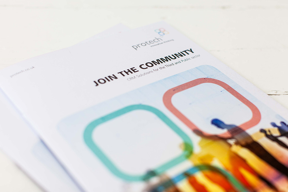
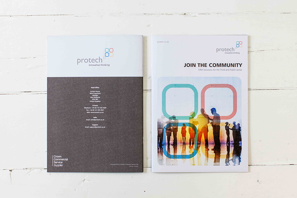
Marketing Campaign Brochure
Initially WE ARE PIXELS were appointed with a brief to develop a marketing brochure aimed at raising the company’s profile to prospective clients.
A new logo solution for the Protech identity was not a design directive as the logotype, brandmark and company tagline had long been established and still remains fresh and relevant for the client and their audience. Therefore working with Protech we agreed a visual style needed to be developed around these existing elements. The all-important priority was to create a unified visual language which could stream across a number of important touch points.
Colour
Brand colour and application of the existing brand colours soon became a key factor when moving the brand forward. The bold and bright colour palette not only helped represent the energy, diversity and sustainability of Protech but also enabled WE ARE PIXELS to incorporate a wide spectrum of colour across all communications, creating visually exciting and distinctive design with bags of Protech’s personality.
We decided not to favour any one single colour from the 4 primary colourways used but instead opted to embrace these equally and help build further recognition for the brand and consistency throughout all marketing.
Infographics, Icons & Imagery
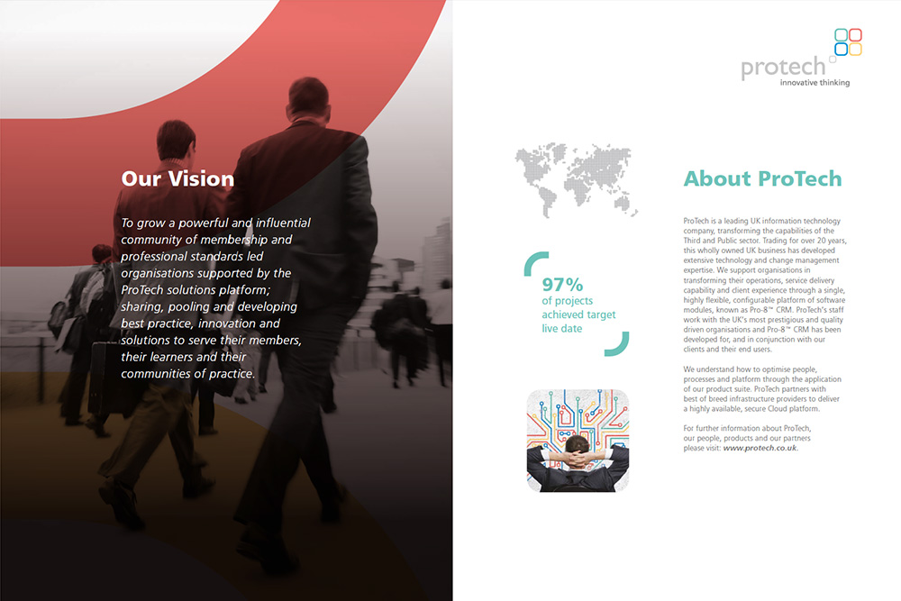
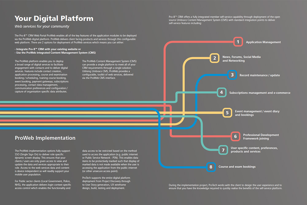
Infographics and icons were a crucial attribute for quickly simplifying the bigger picture of Protech’s complex digital platforms. Creating these assets was instrumental in conveying the brand personality, helping to bring the brand to life and communicate the company’s services, software and approach in an engaging way. Imagery was sourced from stock image libraries and commissioned by WE ARE PIXELS. All library images used within the brochure carefully selected to move imagery away from product focus and align with a more customer/service led focus.
Brochure Stock
Uncoated stock was selected for the brochure output, a key reason for recommending uncoated stock was due to the natural and refined appearance of the paper, uncoated stock has a characteristic which makes images appear softer and warmer than coated stock . The strong and vibrant Protech colourways would also appear more subtle which was another fundamental reason for selecting this type of stock.
FINAL THOUGHTS
The new brochure distinguishes Protech as a leading company in software and professional services industry. The richness in content and re-focused imagery/icons cement Protech as a confident, influential and customer led organisation at the forefront of innovation technology.
CEO Mark Trouth outlined that the company would execute a ‘soft launch’ of the refreshed Protech identity, other touchpoint areas of the business were soon to follow with a similar refresh and re-alignment with the brand identity.