WE ARE PIXELS TALK WEB DESIGN TRENDS 2015
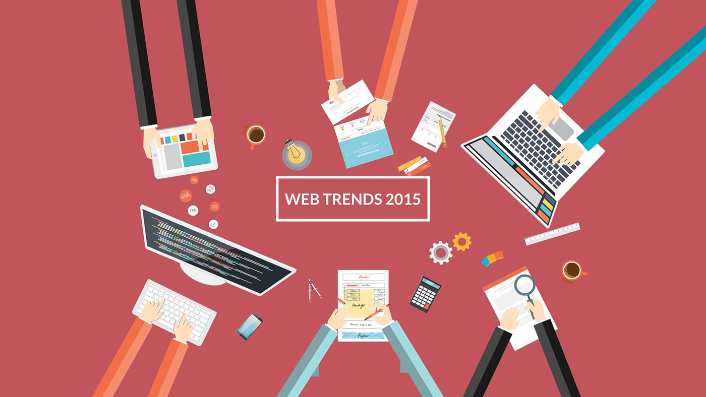
Let’s take a few minutes to look at Web design trends, more specifically let’s just look at the really important stuff. The biggest changes we’ve seen in web design over the last few years. We are going to uncover why these changes have come about and how they effect everyone.
FILL THE SCREEN
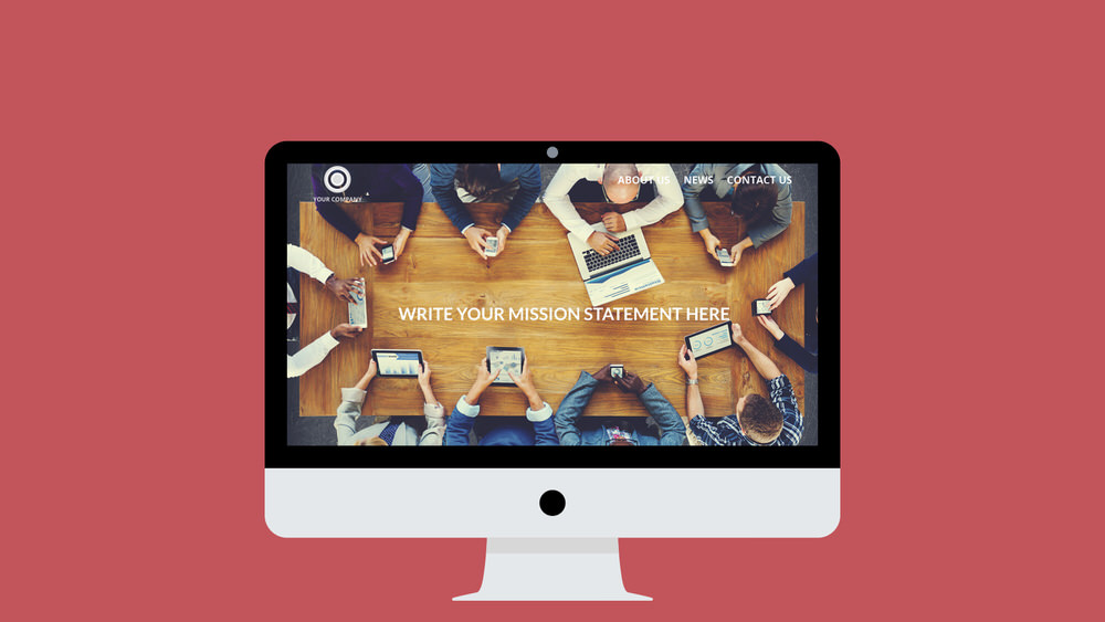
when you surf the web today you’ll come across large landing pages that fill the whole screen, much of the real estate is given to large image sliders or even full screen video often with limited text.
The reason behind this emerging BOOKCOVER design is both creative and practical…
DESIGN FOR ALL DEVICES
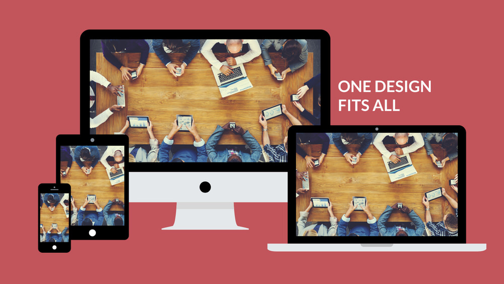
The visual impact is enormous and can focus your viewer on key messages in an uncluttered environment. From a developers point of view the layout can remain unchanged and be just as effective on mobile devices as it is on the desktop.
You can see above how a bookcover homepage can be adapted to work across many different screen sizes.
INFORMATION GOES BEYOND THE FOLD
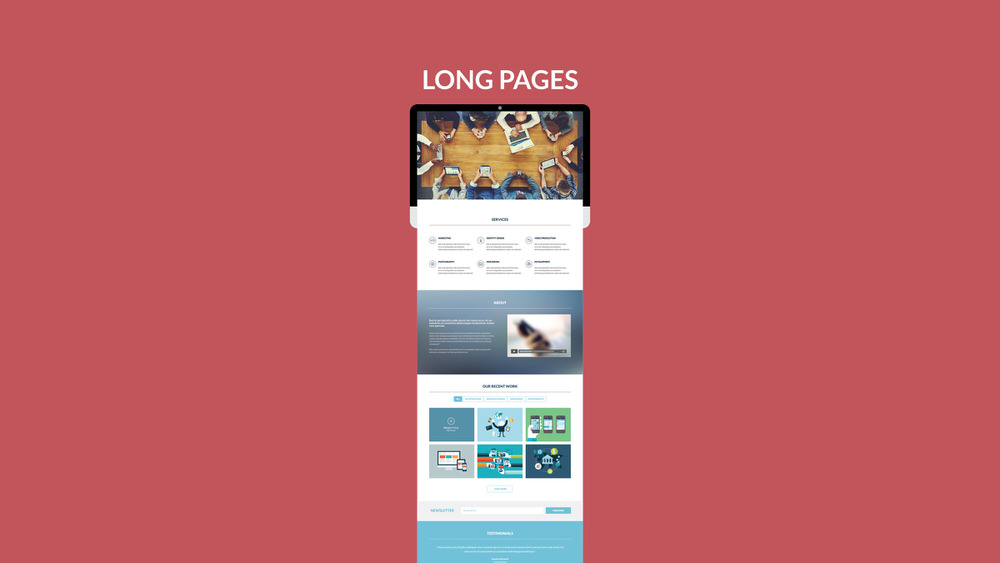
This has led to the emergence of ONE PAGE WEB SITES or websites that contain lots of information on each page. It is not uncommon for pages to be very long.
A good use of this design trend is to use your home page to give an overview of all of your services and then use other pages go into specifics.
A USER EXPERIENCE EVOLUTION
Another trend that has emerged to aid user experience in the era of LONG page websites is the STICKY MENU. As you scroll down a page the main navigation remains glued in it’s location – always at hand.
The user experience benefits of this are clear, the main navigation menu is never out of reach. Play the video above for an animated illustration of a Sticky Menu in action.
SKEUOMORPHIC VS. FLAT DESIGN
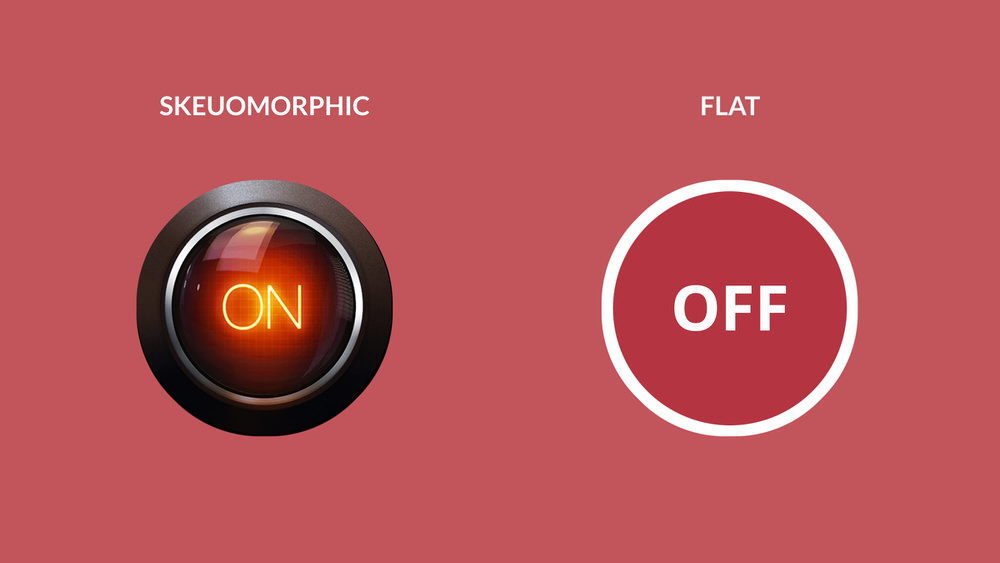
Visual style trends have had a huge impact on web design in the last year or two. Flat design is a very strong feature of modern websites. It began as a reaction to Skeuomorphic design where essentially the principal was that an icon had to look like it’s real life counterpart or had to mimic real life materials… So we had on screen buttons mimicking glass with reflections etc…
The power of flat design lies in how it visually simplifies. This opens up lots of opportunities for a designer, especially for small screen elements such as icons, menus and illustrations. Ultimately by making things clear and simple we can improve the user experience. There is a very good reason why we have historically used flat design for road signs and other important labelling where clarity of message is critical.
A technical benefit of flat design is that you can turn your flat icons into a font, something you can’t do with photorealistic graphics – Icon fonts allow designers to easily scale icons to suit different screen sizes – just as you can with a regular font.
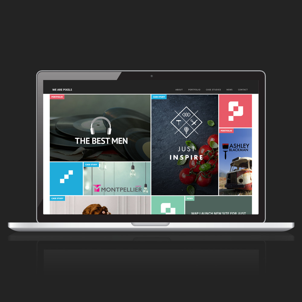
A SITE ON THE TILES
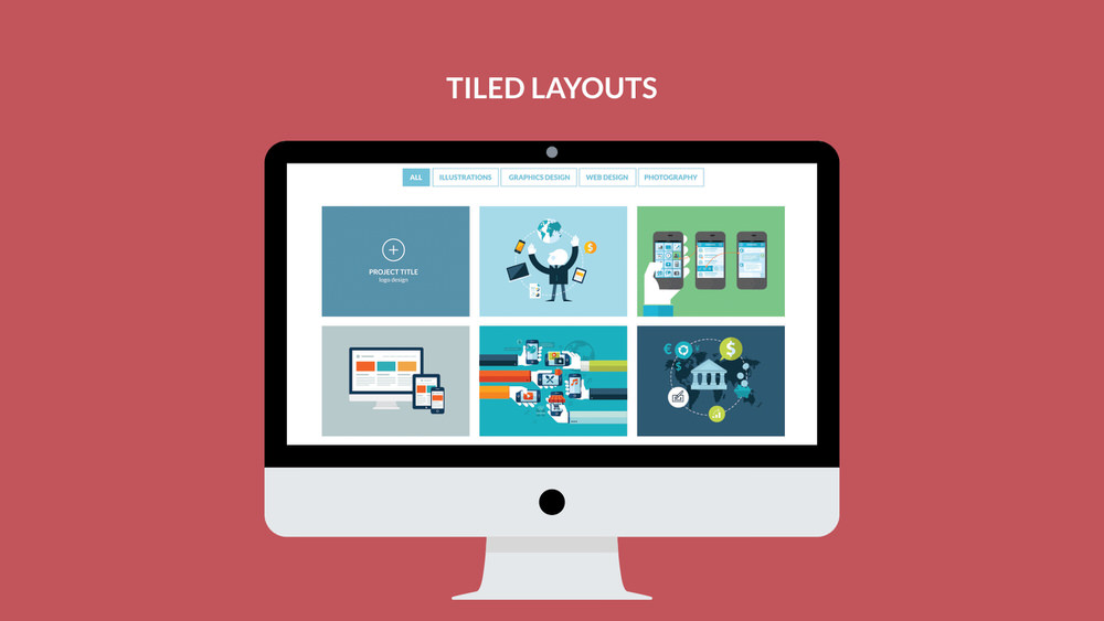
Pinterest started the tile layout craze and it was picked up by Microsoft as a GUI for windows 8 which had a mixed reception but on the web a tiled layout undoubtedly excels – it’s a great way to give the user a snippet of styled information in an eye catching way. For example, on your company news page you could show a preview for each article – an excerpt with accompanying image and a read more button. It’s far more engaging than a simple text link, and more user friendly than stacking up complete articles on your news home page.
The tile layout works particularly well as part of a RESPONSIVE website, which is unquestionably the most important web design trend of recent years. Read on…
ONE FOR ALL AND ALL FOR ONE
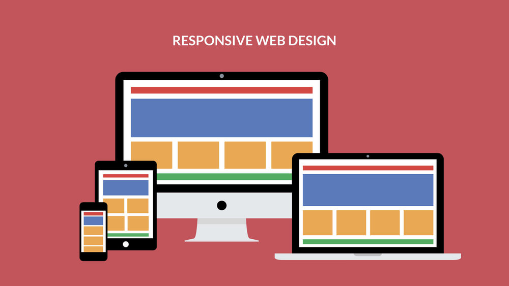
Responsive website design is a response to the increase of internet use by mobile devices which as we know have all sorts of different screen shapes and sizes. The initial reaction to mobile surfing was to provide a separate mobile site that scaled down the functionality of the main website – re-imagining it for mobile use. This was not good from a user experience point of view.
Technology has caught up now and our mobile phones are just as powerful as our laptops for web surfing, the only shortfall is the screen size. With responsive design there is one version of the website providing user continuity across all devices. The elements on screen simply react and re-organise themselves depending on the size of the device.
The image above illustrates how responsive design works through the colour coding of different website elements. You’ll see between on the two big screens not much changes – the content scales slightly but that’s all. At some point though, when the screen size becomes too small to show the content effectively certain elements re-arrange. You can see this in action above. The orange section displays as a 2 by 2 grid on the tablet screen. On mobile the layout is re-arranged again to form one single column of content. This illustrates how a modern website can be successfully rendered across multiple devices.
ARE YOU MOBILE FRIENDLY?
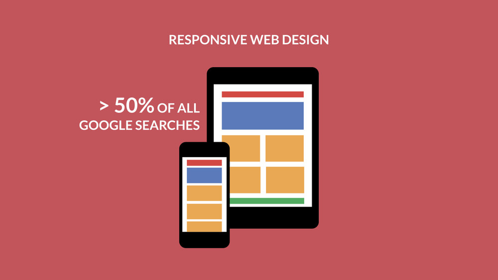
over 50% of all web surfing happens away from the desktop.
April this year saw google introduce the “mobile-friendly” update where mobile friendly sites are flagged for mobile device users and are favoured in search results. Amongst other requirements a site must be responsive to qualify as “mobile friendly”
in may 2015 google released the news that more searches now take place on mobile devices than computers. If you are not mobile friendly you might be appearing in 50% fewer search results.
Change happen quickly. I’ve been a web designer for over 15 years now and i maybe 10% of what I was taught is still relevant today… Maybe even less.
Change is usually driven by advances in technology, like faster broadband speed or higher resolution screens but it is sometimes reactive to new tech. Technology means you can do something snazzy so now we (the designer) needs to find a way to do the snazzy new thing yet keep the USER EXPERIENCE quality high. An example of reactive design is the sticky menu. Suddenly download speeds allowed for huge screen filling images and long scrollable pages… But that meant long pages and a main navigation that disappears from view. The answer? A Sticky Menu.
All of these examples show how you need an expert, or perhaps a whole team of experts to get things right and manage technology updates for your company correctly.

